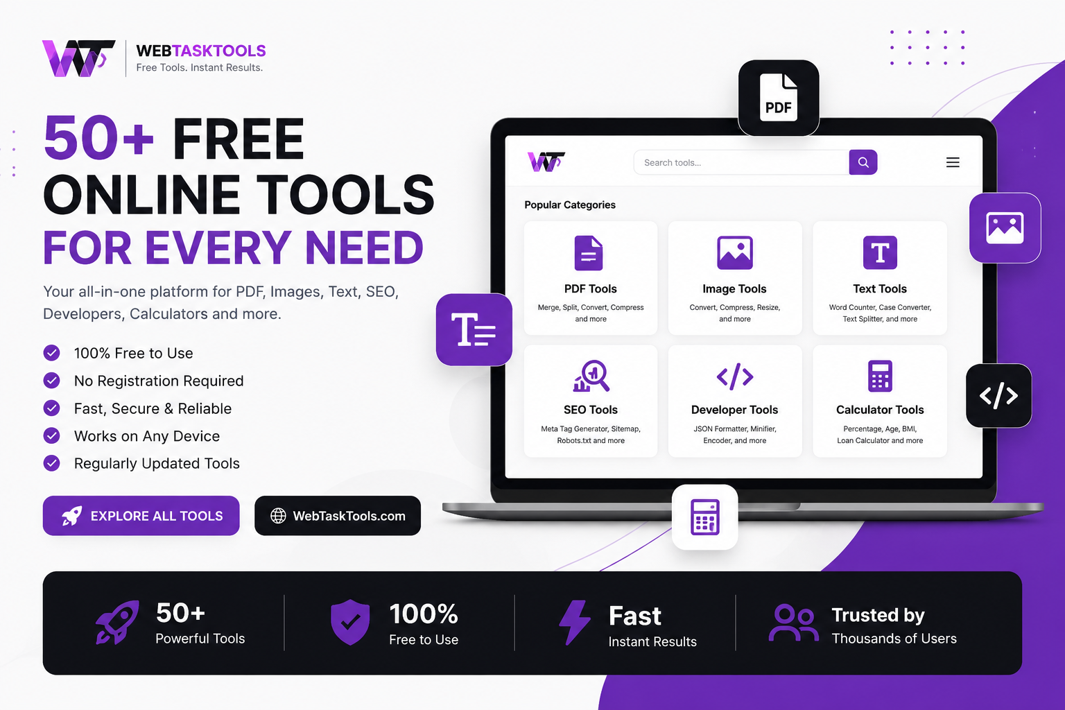
Learn how to reduce image size for websites and social media without losing quality. Use our free online image compressor to speed up your site instantly.
Compress your images now with the free image compressor.
Have you ever uploaded an image to your website or social media, only to notice that your page starts loading painfully slow? Most of the time, the culprit is massive, uncompressed image files.
High-resolution photos look great, but they destroy website loading speeds. Search engines like Google hate slow websites, and visitors will leave your page in seconds if it takes too long to open.
So, how do you fix this? You compress your images. But the big challenge is reducing file size without turning your sharp photos into blurry pixels.
Why Image Compression Matters for Your Website
If you want better search rankings and a smoother user experience, managing your image sizes is non-negotiable:
- Lightning-Fast Speed: Smaller image files load almost instantly, keeping visitors on your site longer.
- Better SEO Rankings: Google rewards fast-loading websites with higher positions in search results.
- Data Saving: Users on mobile phones or limited data plans can browse your content seamlessly without high data consumption.
How to Compress Images in Seconds (For Free)
You don't need expensive photo-editing software or complicated desktop apps to optimize your images. You can do it right in your browser:
- Head over to WebTaskTools.
- Open the Image Compressor tool.
- Upload your large JPEG, PNG, or WebP files.
- Download your heavily optimized, crystal-clear images instantly!
Conclusion
Website optimization doesn't have to be hard. By shrinking your heavy images and combining them with other quick utilities like password generators, QR creators, and code formatters from WebTaskTools, you can completely transform your workflow.
Start compressing your images today and watch your website performance soar!
Lossy vs. Lossless: The Core Tradeoff
Lossless compression shrinks files without changing a single pixel — safe, but modest savings. Lossy compression discards data the eye barely notices — dramatically smaller files, with quality controlled by a setting. Photographs tolerate lossy compression beautifully (they are already noisy); graphics with sharp edges and text prefer lossless or careful settings. Understanding this one distinction prevents most compression disappointment: choose the method by the image type, not by habit.
Choosing the Right Format First
Format choice often matters more than compression settings. Photographs belong in JPG or WebP; graphics, logos, and screenshots in PNG or WebP; simple animations in GIF or video formats. Converting a photograph saved as PNG to JPG frequently shrinks it several-fold before any compression is even applied. The workflow order matters: right format first, then compression — doing it backwards leaves most of the savings on the table.
The Compression Workflow That Works
- Start from the best original: compress copies, never masters. Keep the full-quality original archived.
- Resize before compressing: a 4000px image displayed at 800px wastes the vast majority of its bytes — resize to the display size first.
- Compress once, properly: repeated lossy compression compounds damage. One careful pass beats three aggressive ones.
- Check the output: view at 100% zoom, especially text edges and smooth gradients where artifacts appear first.
- Compare side by side: original vs. compressed, same screen. If you cannot tell, the setting was right.
Responsive Images: Serving the Right Size
A phone and a desktop should not download the same 3000px hero image. Responsive images (srcset in HTML) let the browser pick an appropriately sized file per device — often the single biggest image optimization available, bigger than any compression setting. Combine it with compression: right size per device, compressed well, in a modern format. That trio is the entire professional practice.
Where Compression Artifacts Hide
Learn to spot the warning signs: banding in smooth gradients (skies, shadows), halos around sharp text, blockiness in flat areas, and smeared fine detail (hair, foliage). These appear first at aggressive settings. The fix is almost never "a better tool" — it is a gentler setting, or the right format for the image type. When in doubt, err toward quality: a slightly larger file that looks perfect beats a tiny file that looks cheap.
Images and Page Speed, Honestly
Images are usually the heaviest part of a page, so optimizing them genuinely speeds things up — and speed improves user experience measurably. On the SEO side, keep perspective: page speed is a confirmed ranking factor but a relatively minor one next to content relevance and quality. Optimize images because fast pages convert better and waste less of visitors’ data, with any ranking benefit as a welcome bonus — not the other way around.
Frequently Asked Questions
Will compression make my images blurry? Not at sensible settings. Blurriness comes from aggressive over-compression or from resizing small images up — both avoidable.
Which format is smallest? For photos, modern formats like WebP typically beat JPG at similar quality; for graphics, compare PNG vs. WebP per image. There is no universal winner — test per image type.
Should I compress images already on my site? Yes — run your heaviest pages’ images through the workflow above. It is one of the highest-ROI maintenance tasks in web publishing.
Right format, right size, one careful compression pass, verified by eye. Four steps, and images stop being the thing that slows everything down.
Format Deep Dive: JPEG, PNG, WebP, AVIF, GIF
JPEG: the photograph workhorse — lossy, universal, no transparency. Still the safe default where compatibility matters most.
PNG: lossless, supports transparency — ideal for logos, screenshots, graphics with text. Bloated for photographs.
WebP: modern, efficient, handles both lossy and lossless plus transparency and animation. Broad browser support now; the smart default for web photos.
AVIF: even more efficient than WebP, newer, support still growing. Worth testing for image-heavy sites.
GIF: ancient, limited colors — keep only for simple animations; video formats beat it for everything else.
The practical rule: photographs go to WebP (or JPEG for maximum compatibility), graphics to PNG or WebP, and everything gets compressed after conversion. Revisit format choices yearly — the efficient frontier keeps moving.
Compression Settings: A Practical Guide
Quality sliders are not grades — 80 is not "B-minus." For JPEG/WebP photos, the useful range is wide: high settings preserve near-original quality at moderate savings, medium settings deliver the dramatic savings most sites need, and low settings visibly degrade. The method professionals actually use: compress at a medium setting, view at full size, and nudge up only if artifacts show. Two minutes of looking beats any fixed number anyone quotes — because the right setting depends on the image content, not the format.
E-commerce: Where Images Are Money
Product pages live or die on images: shoppers zoom, compare, and judge quality from pixels. The e-commerce image system: consistent dimensions and backgrounds across the catalog, compressed WebP for speed, zoom-capable higher-resolution versions on demand, and descriptive filenames plus alt text for search. Slow product pages abandon carts measurably — image optimization here is not technical hygiene, it is revenue work. Audit the top twenty product pages first; they carry the sales.
Photographer Workflow: From RAW to Web
Photographers: never compress the master. The pipeline is RAW → edited master (archived, backed up) → exported web copies at needed sizes → compressed per use. Export web copies at the actual display dimensions (no 6000px uploads for 1200px displays), convert to WebP, compress once, and verify. Watermarks and branding go on the web copies, never the masters. This discipline also protects you commercially — the master remains yours at full quality, always.
Social Media: Platform Realities
Every platform recompresses your uploads — often aggressively. The counterintuitive best practice: upload slightly higher quality than you think necessary, at the platform’s recommended dimensions, because their recompression degrades from whatever you give them. Starting clean matters more than starting small here. Keep text in images large and high-contrast; fine detail is the first casualty of platform compression. And keep your own high-quality originals — platforms are distribution, not archives.
Retina and HiDPI: Sharp on Every Screen
High-density displays show more pixels per inch, so a 800px image can look soft on a phone that renders it at 1600 physical pixels. The standard answer: serve 2x resolution for critical imagery (logos, hero images) while compressing well — the file grows, but perceived quality on modern devices demands it. For decorative images, 1x is fine. This is judgment per image, not a blanket rule — apply 2x where sharpness sells, and save the bytes everywhere else.
Lazy Loading and Delivery
Compression shrinks files; smart delivery shrinks perceived waiting. Lazy loading defers off-screen images until the visitor scrolls near them — the initial page loads dramatically faster with zero quality tradeoff. Combined with responsive sizes and compression, this trio (right size, compressed, lazy-loaded) is the complete professional image strategy. Most of it is a few HTML attributes and habits, not infrastructure projects.
Auditing an Existing Site’s Images
For sites with years of accumulated uploads: crawl for the heaviest images (browser dev tools or a site audit list them by weight), convert the worst offenders’ format and size first, then compress. Prioritize above-the-fold and high-traffic pages — the homepage and top landing pages earn the optimization effort; a 2019 blog post with twelve visitors a month can wait. One focused afternoon on the top pages usually removes the majority of image weight site-wide.
Common Compression Mistakes
- Compressing the only copy: always work on copies; masters stay pristine and archived.
- Uploading then compressing: compress before upload — the CMS will not do it well for you.
- Ignoring dimensions: a 5000px image at any quality setting is still a 5000px download.
- One setting for everything: photos and graphics need different approaches; treat them differently.
- Forgetting thumbnails: generate small thumbnails instead of serving full images scaled by CSS.
- Skipping the eyeball test: no setting replaces looking at the actual output.
The 80/20 of Image Optimization
If this guide is too long, here is the short version that captures most of the value: resize to display size, convert photos to WebP, compress once at a sensible setting, check the result visually, and lazy-load below the fold. Five steps, a few minutes per image, and your pages join the fast end of the web. Everything else here is refinement — valuable, but refinement. Do the five steps first, on your most important pages, this week.
Teaching Image Hygiene to Teams
Image bloat is usually a team problem: everyone uploads originals, nobody compresses. Fix it with a one-page standard — max dimensions per use (hero, thumbnail, inline), required format, compression before upload — pinned where content gets created. Better: build the compression step into the publishing checklist so it is not a separate decision. Teams that do this stop having the quarterly "why is the site slow" conversation, because the images were never allowed to bloat in the first place. Prevention beats auditing, every time.
Looking Ahead: The Efficient Future
Formats keep improving, browsers keep adopting them, and the direction is clear: same visual quality for fewer bytes, every few years. The durable skill is not memorizing today’s best format — it is the workflow: right size, modern format, one careful compression pass, verified by eye. That workflow survives every format transition. Adopt it once, and each new format is just a settings change rather than a re-education.
Your move: take the heaviest image on your homepage and run it through the workflow right now — resize, convert, compress, compare. Time it. That number, multiplied across your site, is the business case for everything in this guide.
Quick Reference Card
Photos: WebP or JPEG · resize to display size · compress once · verify visually.
Graphics/logos: PNG or WebP · lossless or careful lossy · check text edges.
Hero images: 2x for retina where sharpness sells · compressed · lazy-load below fold.
Thumbnails: generate real small files · never serve full-size scaled by CSS.
Always: work on copies · descriptive filenames · alt text · compressed before upload.
Pin that reference card where you publish. Future-you — staring at a 9 MB upload wondering what went wrong — will be grateful.
And when the next format arrives — as it surely will — you will already know exactly what to do with it.